Health information management
Redesigning a workflow for Deficiency Management analysts.
Can we update our Deficiency Management solution to make it easier for analysts to make sure physicians' documents are in compliance with hospital standards?
My Role
UX design · Workshop facilitator
Team
1 UX designer · 3 developers · 1 product strategist · 3 product owners
Tools
Miro · Sketch
This project was a complete overhaul of a complex, 15-year old product. I am most proud of convincing a product team to try their first design sprint and to see the outcomes of user research.
Meeting the team...and their problems
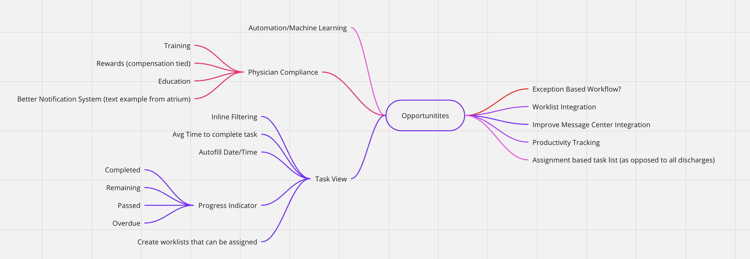
We first met with the product team to get an understanding of what they saw as the problems within the Deficiency Management product. We listened to feedback they had gotten from customers over the years and picked their brain for opportunities to improve what already existed.
- How did users currently use the application?
- What frustrates our customers today, and what to they want to see going forward?
- Looking into the future, can we leverage design and technology to make their daily life easier?
Using new methods
After meeting with the product team, we saw that there were a lot of ideas that had been built up over the years. Looking for a way to organize everyone and get us on the same page we decided to run a Design Sprint for the team.
During that week we:
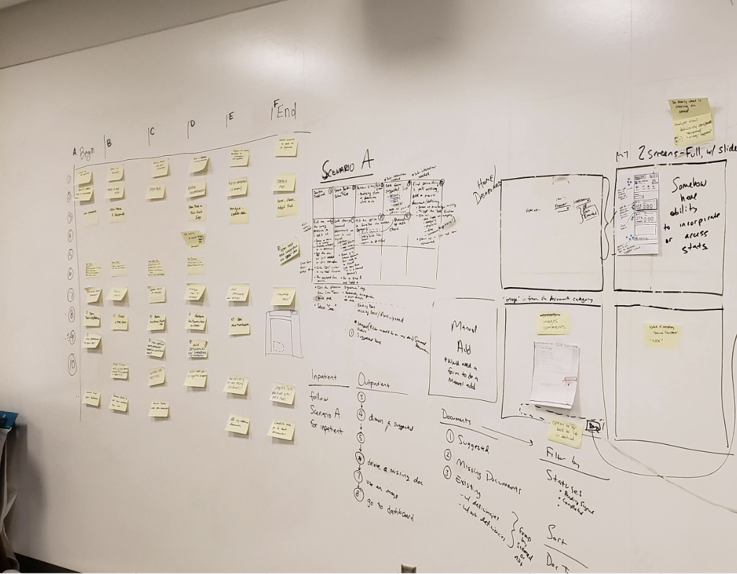
- Card sorted
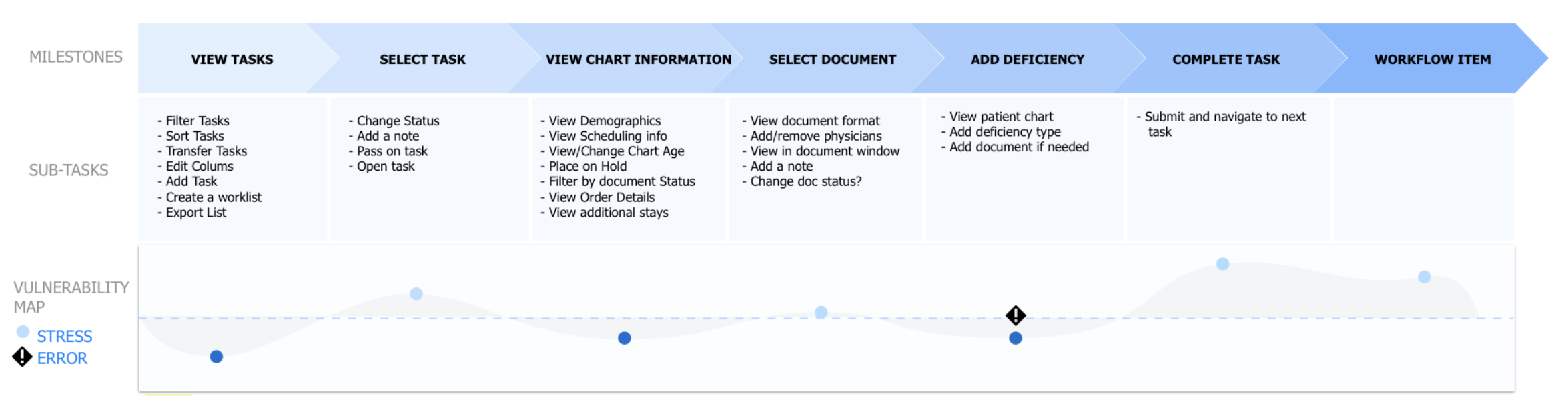
- Made a journey map
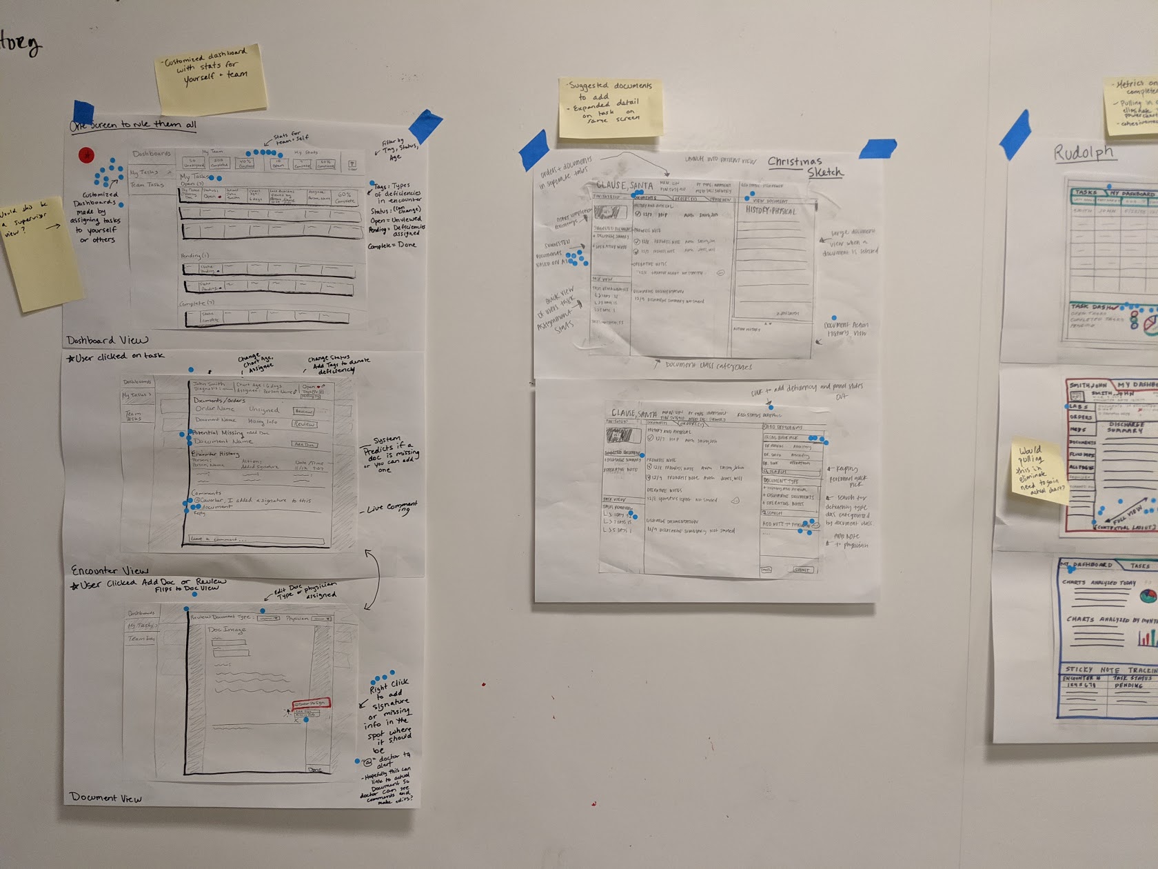
- Sketched
- Prototyped
- User tested
Prototyping
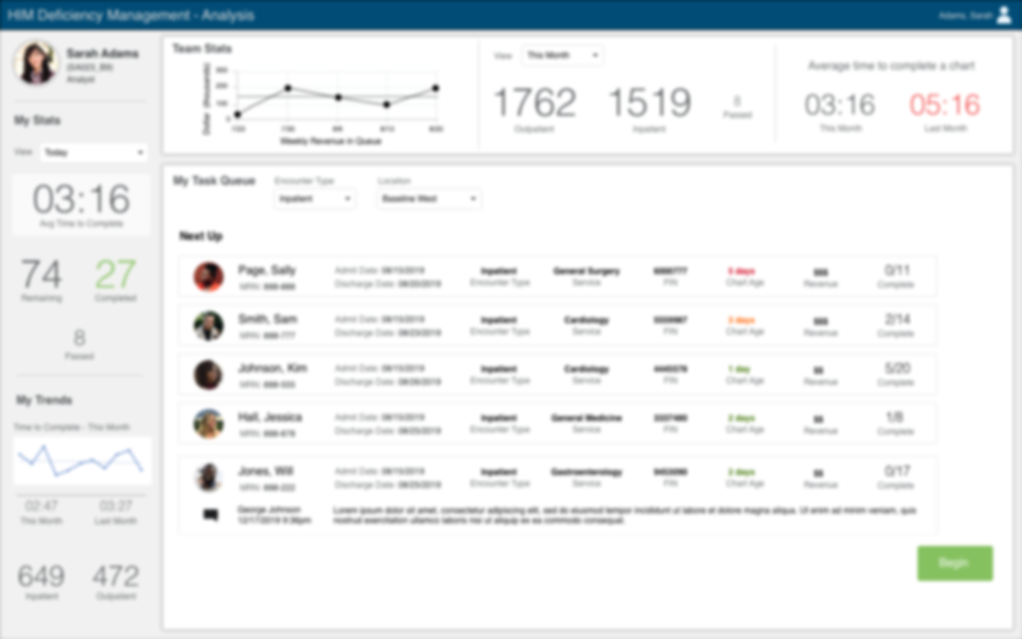
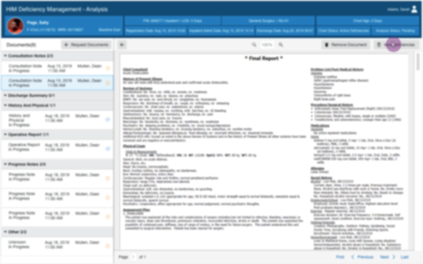
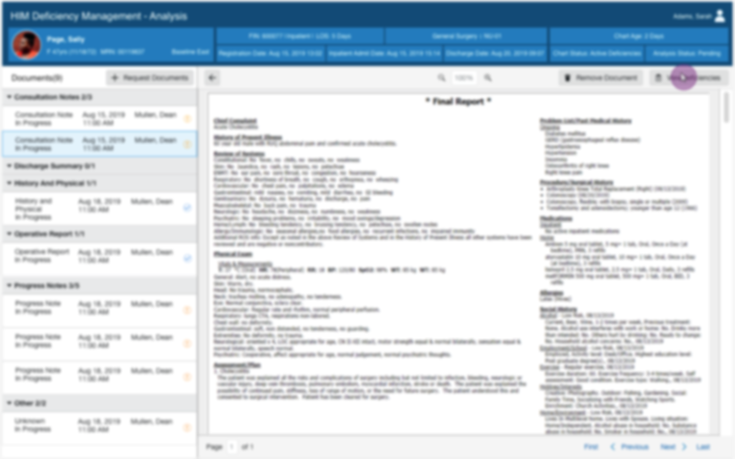
After the sketching day of the Design Sprint, we wrote out a script of what we wanted to show users, including certain vignettes and moments that we wanted tested. We knew we want to test a dashboard concept for the analysts to be able to review their tasks for the day, and we also wanted to improve upon the screen real estate for actually viewing the images of the documents they were reviewing.
Usability Testing
The prototype was a quick run through of all the ideas we wanted to test, and one of our researchers ran the participants through the prototype while the rest of the team observed. Everyone on the team wrote down their observations, and then we summarized our thoughts together.
Dashboard View
Users understood the task queue concept that we introduced, but labeling could be improved.
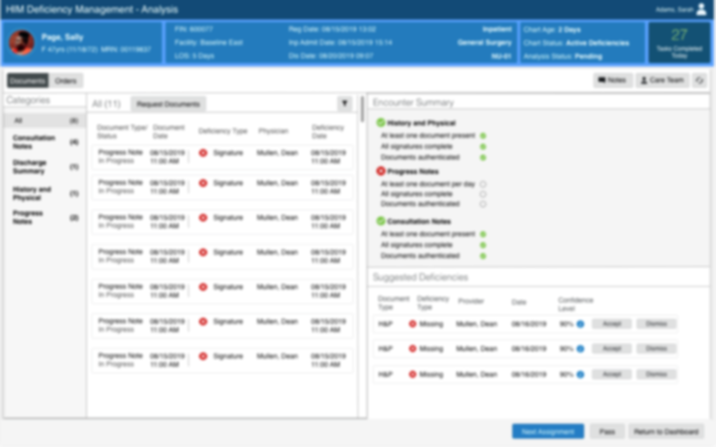
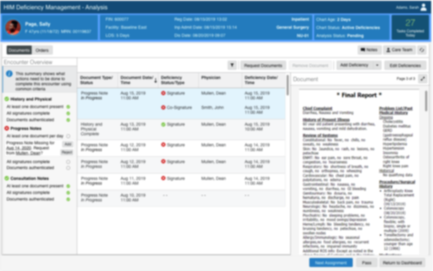
Encounter View
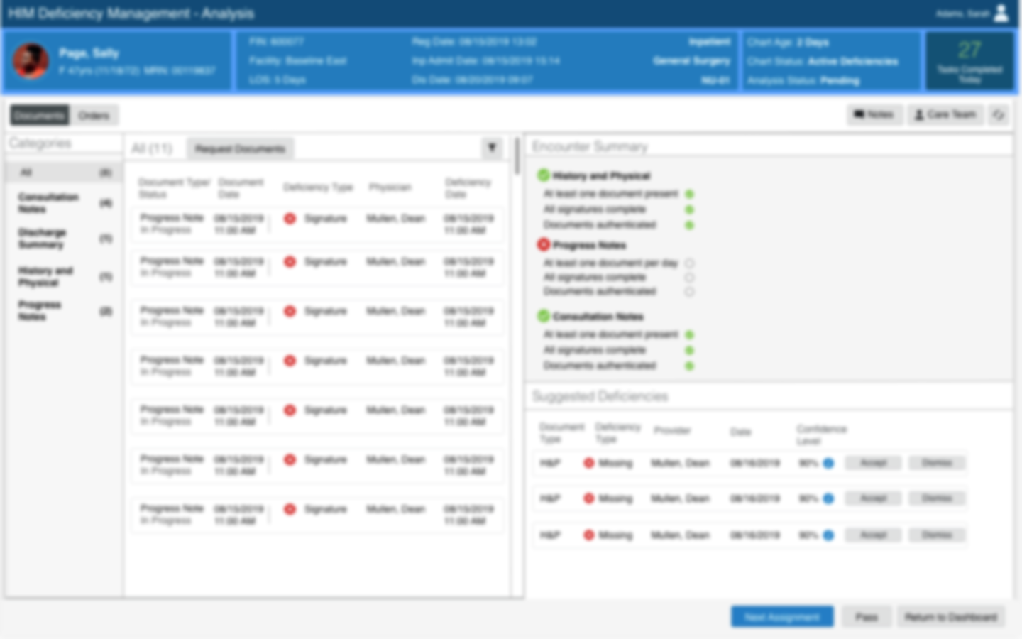
Users liked that the document was now tied to a patient encounter, so that we were able to pull in relevant information like the Care Team that the users used to have to go to another application to find.
Suggested Deficiencies
In our prototype we suggested different types of deficiencies for the user to add to speed up their tedious work process, however there was some confusion around terminology and where the suggestions were coming from.
After the Sprint
Overall our main ideas were vetted through the sprint, in the months following we got continuous feedback from internal stakeholders and continues to iterate on the design.
Additionally since this was all our first sprint I ran a retrospective to see how I could make improvements when facilitating my next workshop.
Next steps
While we continued iterating on the navigation on the document viewer, I would've loved to have more time to revisit the dashboard concept. The dashboard was something new for the analysts that gave them a home base to see how they were performing, but since it was a brand new concept time and energy was spent on improving what already existed.
Learnings
This project was instrumental in shaping me as a designer. I learned how to communicate with a product team and how to navigate several ideas to bring the best ones to the forefront. Oftentimes in project work it is more about making everyone feel that they have a part in the design process and that they are being heard, which is why I think the Design Sprint was such a success.